Bruce McLaren’s kiwi emblem: history, design, and meaning
The kiwi on Bruce McLaren’s original 1964 crest was not decoration. It was a declaration of origin, drawn in the language of classical heraldry when racing teams still thought in coats of arms.
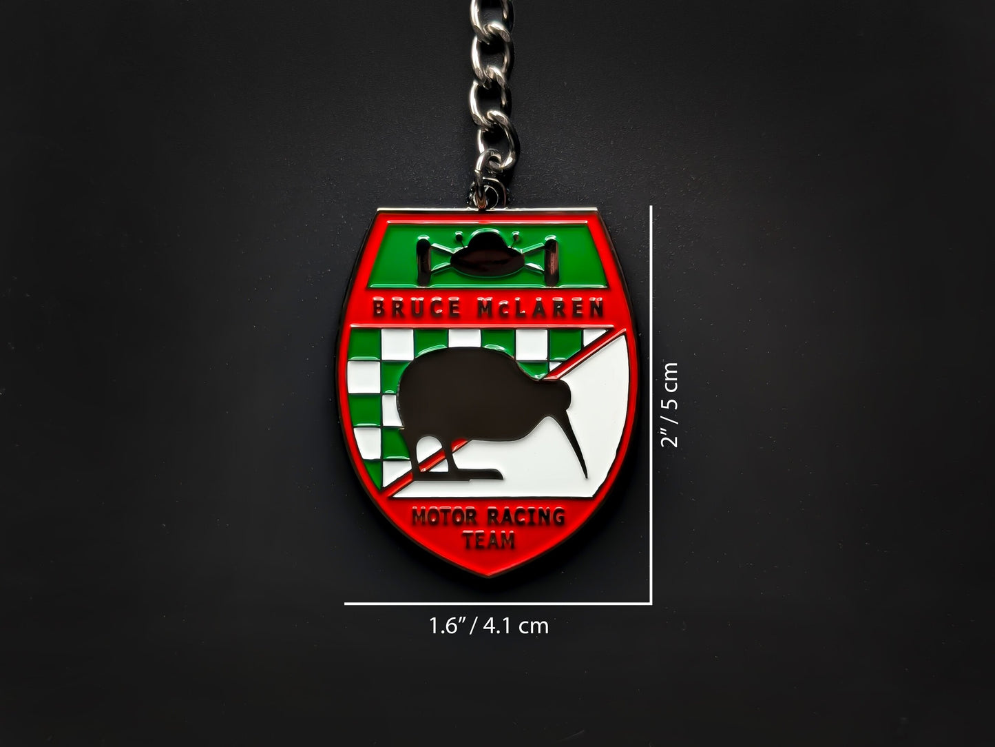
The original Bruce McLaren emblem was drawn in 1964 by motorsport artist Michael Turner, a close friend of Bruce McLaren. It took the form of a heraldic crest: a shield with a black kiwi bird at its center, a green-and-white checkered panel across the top, a diagonal stripe, and a Grand Prix car silhouette sitting above. Every element carried meaning. The kiwi marked Bruce McLaren's Auckland origins, the checkered flag the finish line, and the GP car the kind of racing the team intended to do.

That emblem debuted in September 1964 on the M1A sports racer at the Canadian Grand Prix at Mosport Park, connecting a fledgling New Zealand-founded outfit to the storied visual language of European heraldry at almost the same moment it was competing against established factory teams. What made it unusual was its honesty. The crest was personal before it was corporate, and the kiwi was not chosen for market research reasons. It was there because Bruce McLaren was from New Zealand, and that was enough.
A shield built from biography
Bruce Leslie McLaren was born in Auckland on August 30, 1937, the son of Les McLaren, a garage owner and motorcycle racer. At nine years old he was diagnosed with Legg-Calve-Perthes disease, a hip condition that kept him in traction at the Wilson Home in Takapuna for three years. Doctors ruled out contact sports permanently. Mechanics and racing took their place. By fourteen, Bruce and his father had rebuilt a 1929 Austin 7 Ulster from parts, and that car became his first competitive vehicle. In 1958, he won the inaugural New Zealand 'Driver to Europe' scholarship, the first recipient of a program that would later produce a generation of New Zealand racing exports.
When the Cooper Car Company declined to supply 2.5-litre engines for the Tasman Series, Bruce founded his own team rather than wait on someone else's schedule. The kiwi on the crest was not nostalgia for its own sake. It was the mark of a driver who had travelled 18,000 kilometers from home to compete, carrying New Zealand with him because there was no reason not to.
Michael Turner's original 1964 design nested four distinct symbols inside one shield. The kiwi, New Zealand's flightless national bird, occupied the central field. The checkered flag sat at the crest's top panel. A diagonal stripe cut across the shield in a convention drawn directly from classical European heraldry. And a Grand Prix car silhouette, set inside a black-bordered rectangle above the whole structure, left no ambiguity about the arena. The typography at the base read "BRUCE McLAREN MOTOR RACING TEAM" in unambiguous block letters.
The paradox of a flightless bird
As McLaren's cars got faster and the team's operations expanded from a small garage at Colnbrook outward into serious international competition, the original crest began to look incongruous. A dense, heraldic shield belongs on a blazer or a letterhead. On the flanks of a Can-Am sports racer doing 180 miles per hour, it reads as noise.
By 1968, after Bruce McLaren's first Formula One victory at Spa-Francorchamps in the M7A, the surrounding shield was already being stripped away from the car liveries, leaving the kiwi silhouette to stand on its own near the cockpit. The bird was still the point, but the format had to change.
Teddy Mayer, the team's business director, had hired a local signwriter and commercial artist named Doug Eyre, whose workshop happened to be just up the road from Colnbrook. Mayer called, learned Eyre was nearby, and said "Great. We'll see you in 20 minutes then." Eyre's two decades in Formula One produced hand-painted liveries and helmets for Graham Hill, Jackie Stewart, and the Williams team, including the painstaking tartan bands on Stewart's helmet.
Streamlining the kiwi was a physics problem. A kiwi is a flightless, slow-moving bird with a rounded body, a downward beak, and vestigial wings. None of those traits communicate speed. The solution stripped the bird to its silhouette, with the neck radically elongated, the beak dropped to a forward angle, and the legs repositioned into a full-sprint posture. McLaren's own heritage telling credits Michael Turner with this redesign, the same artist who had drawn the 1964 crest, though some accounts instead credit the team's signwriter Doug Eyre. The resulting "Speedy Kiwi" turned the same animal into something aerodynamic. The body became a teardrop shape, the beak a forward vector, the legs an implication of velocity rather than waddling.

When the Speedy Kiwi was rendered in Papaya Orange, the color Teddy Mayer had spotted on a competitor's car at a British race meeting and adopted for its contrast on black-and-white television screens, the combination became a period-defining image in motorsport. Bruce McLaren did not live to see the Speedy Kiwi integrated as the team's official logo. He was killed at Goodwood on June 2, 1970, while testing the M8D sports car.
What the Marlboro years buried and what Zak Brown recovered
The Speedy Kiwi survived until 1981, when the merger of the original Bruce McLaren/Teddy Mayer outfit with Ron Dennis's Project Four created McLaren International, funded substantially by Philip Morris. Raymond Loewy, the industrial designer behind the Lucky Strike pack and the Shell and Exxon logos, was commissioned to rebuild the team's visual identity from scratch. The resulting design replaced the kiwi with a set of red-and-white chevrons that, whatever the official explanation about checkered flags, mapped directly onto the corner packaging of a Marlboro cigarette box. A new shade called "rocket red" was developed specifically because standard Marlboro red read too dark on color television broadcasts.
The kiwi was gone from the cars for the better part of four decades. Ron Dennis's stated philosophy, summarized repeatedly as "I don't look back, I only look forward," left little room for a symbol whose meaning was biographical rather than commercial.
Zak Brown's arrival as CEO reversed that. The campaign Brown initiated, which McLaren's New Zealand fanbase and the team's own heritage communications began calling "Kiwiness," returned Michael Turner's original 1964 crest to the bodywork of the Formula One cars at the 2023 Italian Grand Prix, sixty years after its debut. The same year, the kiwi appeared on the team's Formula E cars, its first official presence on a factory-backed single-seater in 52 years. Engineers, taking their own approach to continuity, had been placing small kiwi stickers on internal chassis components for years, on parts like the DRS actuator housing, invisible to cameras but present nonetheless.

Sixty years bridged in one frame, the original kiwi crest beside a current McLaren helmet.
Bruce McLaren's daughter Amanda, who was four years old when her father died, took over the Bruce McLaren Trust and has been central to this revival. The line most often quoted from Bruce McLaren comes from his 1964 book 'From the Cockpit': "life is measured in achievement, not in years alone." The kiwi crest, commissioned the same year those words were written, is the oldest surviving evidence that he meant them.
Six decades on, the kiwi's return to McLaren's cars is less a nostalgic gesture than a correction. The original crest was biographical, specific, and honest. Those qualities proved more durable than any sponsor's color.
In summary
Why is there a kiwi bird on the McLaren logo?
Bruce McLaren chose the kiwi as a symbol of his New Zealand origins when he commissioned the team's first crest in 1964. New Zealand's national bird gave the car an immediate visual marker of where its founder came from. The bird has appeared in various forms on McLaren cars and branding from 1964 to the present day.
Who designed the original McLaren emblem with the kiwi?
The original 1964 McLaren crest was designed by Michael Turner, a motorsport artist and close friend of Bruce McLaren. Turner built the design as a traditional heraldic shield with a central kiwi silhouette, a checkered flag panel, a diagonal stripe, and a Grand Prix car silhouette above the shield. The full team name appeared at the base in block capitals.
What does the Bruce McLaren crest symbolize?
Each element carries specific meaning: the kiwi is Bruce McLaren's New Zealand heritage, the green-and-white checkered flag pattern at the top is the racing finish line, the diagonal stripe references classical European heraldry, and the Grand Prix car silhouette places the team in its competition context. Together they read as a biographical coat of arms for a New Zealand driver who built his own F1 team.
Who redesigned the McLaren kiwi into the Speedy Kiwi?
McLaren's official heritage credits Michael Turner, who drew the original 1964 crest, with streamlining it into the running Speedy Kiwi around 1967, though some accounts credit the team's signwriter Doug Eyre instead. The redesign elongated the bird's neck, lowered the beak, and set the legs into a sprinting posture to convey speed. It was rendered in Papaya Orange.
When did McLaren stop using the kiwi logo?
The kiwi was removed from McLaren's primary corporate identity in 1981 when the merger with Ron Dennis's Project Four created McLaren International, backed by Philip Morris. Raymond Loewy was commissioned to redesign the team's visual identity, and his red-and-white chevrons aligned the look with Marlboro branding, replacing the Speedy Kiwi. The kiwi did not return to the race cars officially until 2023.
Did the modern McLaren Speedmark logo evolve from the kiwi?
Brand historians have noted a geometric connection between the 1997 Speedmark and the Speedy Kiwi: the asymmetrical sweep, the downward curve, and the weighted arc of the Speedmark closely mirror the anatomical lines of the running Speedy Kiwi silhouette. Officially, McLaren describes the Speedmark as representing aerodynamic vortices from a rear wing. Whether the visual link to the kiwi was conscious or organic remains an open question.