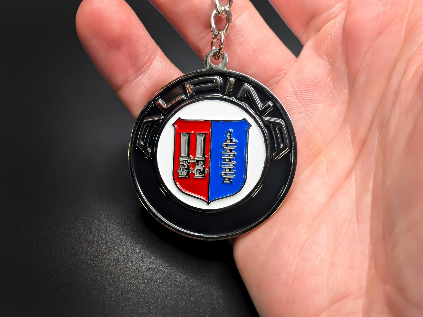
Carburetor, crankshaft, and a BMW veto: Alpina’s badge origin story
How a rejected Bavarian-diamond logo, a BMW veto, and a family typewriter trademark produced a badge that changes its mechanical parts every time the engine does.
The BMW Alpina emblem, a split heraldic shield with red and blue halves, was born from a corporate rejection. At the 1967 IAA Frankfurt show, BMW vetoed Burkard Bovensiepen's first badge proposal and forced him to start over. The crest he settled on stamped a dual carburetor and camshaft inside the shield, a literal diagram of the engine work his company did, updated in 1974 when fuel injection arrived. On January 1, 2026, BMW completed its acquisition of all Alpina brand rights, and the heraldic shield was retired for a simplified, color-free emblem.
Bovensiepen's 1962 starting point was a dual-carburetor kit for the BMW 1500, a car the press admired for its chassis and criticized for its output. His Weber-based conversion drew attention quickly enough that BMW's sales chief, Paul G. Hahnemann, took notice, and by 1964 BMW officially certified Alpina's modifications with a full factory guarantee. That certification was an extraordinary concession for the era.
On January 1, 1965, Bovensiepen formally registered Alpina Burkard Bovensiepen KG in Kaufbeuren, Bavaria, with eight employees, working out of a converted outbuilding of his father Rudolf's typewriter factory. The "Alpina" name came directly from that factory's product line, the office machinery company his father had built.

The IAA conflict and what it produced
The circular badge Bovensiepen brought to Frankfurt in 1967 borrowed the blue-and-white diamond pattern of the Bavarian state flag, and BMW management rejected it on the spot. The concern was trademark confusion and dilution of BMW's own corporate identity, which drew heavily on the same Bavarian color tradition. The diamond badge never went into production. Bovensiepen's solution, arrived at the same year, was to step away from regional symbolism entirely and toward heraldry. The approved crest introduced a shield split vertically down the center, red on the left, blue on the right, set inside three concentric circles. The outer ring carried the capitalized wordmark "ALPINA" in white sans-serif across the top arch, in a font whose stroke width matched the width of the silver border rings exactly. The split shield format has a long history in European heraldry, where vertical division signals a joining of two distinct entities or lineages. Here it served a different purpose: it gave each half its own mechanical motif, turning the badge into a diagram of the powertrain.
A badge as engineering logbook
Weber dual carburetors on the left side of the 1967 shield, a camshaft on the right. The Webers were the core of the original 1962 kit; camshaft profiling was one of the primary levers for extracting higher output from BMW's four-cylinder and six-cylinder engines. The crest was an engineering record of what Alpina actually built. In 1971, the camshaft was replaced by a crankshaft. Alpina had shifted its focus toward displacement expansion and low-end torque, building road cars that prioritized pull across a wide rev range rather than peaky top-end power. The crankshaft emblem signaled that shift directly.
In 1974, the left-side carburetor was replaced by a single throttle body, because fuel injection was displacing carburetion across the industry. The updated emblem documented the transition as it happened in Alpina's own engine development. That 1974 configuration, throttle body left, crankshaft right, survived through four decades of incremental visual refinements, including a 2002 update that introduced three-dimensional chrome gradient rendering for digital reproduction. Four decades. The mechanical content of the shield did not change again until 2026.
One aspect of the color reading deserves honest qualification. The dark red and dark blue of the shield halves have been widely interpreted as a reference to the Bavarian state flag or to BMW's corporate palette, and both readings are plausible. But they are interpretations, not confirmed official statements from Bovensiepen or Alpina. What is confirmed and often overlooked: Alpina's official house colors are not red and blue. The corporate paint colors are Alpina Blue and Alpina Green, carried through proprietary metallic finishes, interior stitching, and the pinstriped "Deco-Line" that runs along the flanks of every car. The crest's color split and the brand's vehicular color identity have always been separate systems.
One rule governed where the classic crest could appear: never on the exterior sheet metal of the car. Bovensiepen kept the BMW roundel on every hood and trunk, reinforcing that these were BMW Alpinas rather than stand-alone Alpinas. The shield was restricted to the steering wheel boss, the center caps of the signature 20-spoke wheels, valve covers in the engine bay, and interior plaques. That boundary held for nearly sixty years.
The 2026 redesign and the paradox it inherits
Transparent background. Flat navy linework. A throttle body and crankshaft with no shield around them, no color fields, no concentric rings. BMW Alpina's chief designer Maximilian Missoni revealed that form in February 2026, when the physical badge went public. The acquisition agreement had been announced in March 2022; full brand rights transferred to the BMW Group on January 1, 2026. The new badge is also authorized for exterior body panels for the first time, a direct reversal of Bovensiepen's original placement rule. Car and Driver reported the change as part of a wider repositioning aimed at placing the brand above the top BMW price point and below entry-level Rolls-Royce, in direct competition with Mercedes-Maybach.

The mechanical motifs that survived the redesign now sit in an awkward position. BMW has publicly acknowledged speculation that future Alpina models may use electric platforms, including derivatives of the i7. Putting a badge displaying a throttle valve and a crankshaft on a car with no combustion engine and no moving powertrain components of that kind is a visible contradiction. The BMW Group's stated position is that the mechanical symbols now function as historical markers rather than literal descriptions of the hardware underneath, the heritage of the brand made visible in the design language. Whether that framing holds as the product lineup shifts is a question the emblem will eventually have to answer by itself.
The throttle body and crankshaft that Bovensiepen first placed on a shield in 1967 have outlasted the shield itself. And in the end, what started as a workaround for a corporate veto turned out to be the most durable part of the identity.
In summary
Why does the Alpina badge have a carburetor and crankshaft on it?
The mechanical parts reflect what was at the center of Alpina's tuning work when each badge version was drawn. The 1967 crest showed a Weber dual carburetor and camshaft; the carburetor was replaced by a throttle body in 1974 when fuel injection arrived, and the camshaft had already been replaced by a crankshaft in 1971 to reflect Alpina's focus on torque and displacement.
What do the red and blue colors on the Alpina logo mean?
The red and blue halves of the classic shield are widely read as a reference to the Bavarian state flag or BMW's corporate colors, but Alpina has never confirmed either interpretation. Alpina's actual house colors are green and blue, not red and blue, expressed through proprietary paint finishes and interior stitching.
Where does the Alpina name come from?
Alpina has nothing to do with the Alps. Burkard Bovensiepen borrowed the name from his father Rudolf's company in Kaufbeuren, Bavaria, which produced office machinery under the Alpina trademark, including a well-known line of typewriters.
Why did BMW block Alpina's original logo in 1967?
Bovensiepen's first badge proposal used the blue-and-white diamond pattern of the Bavarian state flag, which BMW management felt was too close to its own corporate identity and could cause brand confusion. BMW prohibited Alpina from using the design at the 1967 IAA Frankfurt show, forcing Bovensiepen to produce the heraldic shield version instead.
Why did BMW change the Alpina logo in 2026?
The BMW Group completed its acquisition of all Alpina brand rights on January 1, 2026, and used the transition to update the visual identity for a repositioned ultra-luxury lineup. The new badge removes the heraldic shield and color fields, retaining only the throttle body and crankshaft in a flat, transparent format suited to exterior body panels and digital interfaces.
Why was the Alpina shield never placed on the outside of the car?
Bovensiepen deliberately kept the BMW roundel on every hood and trunk to signal that his cars were BMW Alpinas rather than independent replacements. The Alpina crest was restricted to the steering wheel, wheel center caps, engine valve covers, and interior plaques. The 2026 BMW-controlled redesign reversed this rule for the first time.